Welcome Emails; Is yours Welcoming? How to get the basics right.
An effective email marketing strategy is perhaps the most powerful marketing tool any online retailer can have in their arsenal. It can turn curious prospects into conversions and first time purchasers into loyal long-term customers. With a welcome email specifically, every send marks the start of a new customer relationship. As with any relationship, you want to kick off on the right foot, which is why having a powerful welcome is so important! The very first emails that your customer receives after signing up to your newsletter will set the tone for your new relationship - so luckily, the tone that is set is up to you.
Your welcome emails will be the most widely viewed of them all, so be assured that it will leave a lasting impression. Welcome emails have significantly higher open and click through rates compared to other campaigns with an average open rate of 50% and click through rate ranging from 6 - 10%! It’s a really great opportunity to promote some crucial information. Your email may be aimed at initiating a purchase or giving an introduction to your newsletter, it might be short and punchy or a multi-part series. There’s a huge range of choices, so where do we start? To cover your bases and to ensure that your welcome email is as effective as possible, let’s go through the basics: Structure, Timing and Content.
STRUCTURING YOUR WELCOME EMAIL.
A very common issue we often face when collaborating on a welcome series isn’t necessarily knowing what to cover but rather, how best to structure it. The structure of your welcome email(s) will be heavily influenced by the overall brand elements you have chosen to focus on. Will you focus on your values, your history, your products, what to expect from your newsletter? I’m sure you’ll have a huge range choices spring to mind straight away. Most welcome email focusses often fall into one of 3 categories, or a combination of these:
- Brand e.g. stories, history, values or practices.
- Product e.g. most popular or new arrivals.
- Incentives e.g. on first purchase or return purchase.
As today’s consumers continue to grow more mindful of the practices, beliefs and people behind brands, it’s important to really hone in on the things that you know your customers will be most interested in. On average, 80% of people will be scanning your email, so think long and hard about the brand element (or elements) which prompted the customer to sign up to your newsletter in the first place. Have this element as the prominent feature in your email, then structure the rest of your email around that. When structuring your welcome email consider the following:
- If there are quite a few topics you would like to cover in welcoming your new customer, consider spreading your email across a series. This is particularly effective for situations where you would like to cover multiple things that are equally as important to your brand, but don’t directly relate (e.g. new arrivals and a bio on your founders). You may also find that you want to cover a range of brand elements which has your email technically fall in all 3 of the categories listed above. In which case, brands will very commonly use 3 emails in a series to effectively cover everything.
- Separate your content into different sections to make the email as readable as possible. Have the most relevant/important sections the main feature.
- To keep your email as succinct as possible, link sections within your email back to on site CMS pages. For example, rather than giving the full spiel about your brands manufacturing processes, give a brief but effective overview and add a CTA which sends the customer to your Manufacturing page on site.
Keep these in mind when considering the examples given later in this article!
TIMING - DON’T SLEEP ON THE SEND.
Your customer should receive their first welcome email straight away. When a customer signs up to join the email database you are, in that moment, at the very top of their mind. Send your welcome email straight way to ensure the customer receives all of this crucial information in front of them right when they are thinking about you so don’t wait a second so catch them. The options that you will have available for triggering your welcome email will be reliant on what mailing platform you are on and what integrations you have in place.
Timing is also an extremely important factor to take into account if structuring your welcome emails as a series. The time in between your series of emails should be indicative of your regular email marketing schedule, while still keeping the recency of the information in mind. Avoid having your customers experience a surge when signing up and a significant dip in emails following the welcome series. Again, dependant on what email platform you are using, you may have the option available to phase the customer into regular email marketing. More advanced programs will not send your customer any marketing emails until their very final welcome email is sent.
CONTENT, CONTENT, CONTENT!
Now that you know what you want to talk about, how many emails you will be sending and when you’re going to send them let’s get to the really fun stuff - the content! The copy and content in your welcome series is going to set the scene for your relationship to come, so think carefully about the language and imagery that you use.
COPY
- Stand out in your customers inboxes by having an exciting and captivating subject line - don’t be shy of emojis! Including emojis in email subject lines leads to a 56% higher open rate compared to text-based subject lines. Test what emojis resonate best with your customer and don’t be afraid to get creative!
- Utilise your brand voice and really introduce yourself in the heading. Let your customers know that they’ve joined something good by greeting them - make them feel welcome.
- Get personal. There is no easier way to make someone feel more valued and welcome than by addressing them directly. If you collect your customers names on sign up, consider pulling this into the email header or banner.
- Choose your words wisely. Think about how you can best get your message across without overloading your customers with copy. Remember to link to your CMS pages and social accounts to assist here.
CREATIVE
- Use GIF’s to make your emails dynamic and exciting!
- The human brain processes images 60,000 times faster than text so select imagery that speaks to your brand and the overarching objective of your email. At a glance your customers should know what your email is about.
- For more technical information consider the use of infographics and iconography to make this section more digestible.
- Highlight some key value props around logistics e.g. customer service links, shipping etc. As an online store, these will be relevant to any focus!
With these points in mind, let’s look at some industry examples of welcome emails tackled from a few different angles.
BRAND

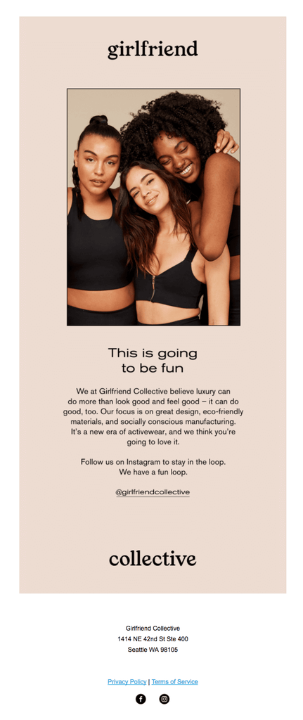
Girlfriend’s email is a great example of a succinct welcome that utilises imagery and copy to give a brilliant snapshot of what their brand is all about. The chosen imagery is very telling of an all inclusive, feminine brand and their opening headline ‘This is going to be fun’ instantly has the reader excited about what is to come from girlfriend’s emails. While there are some great brand values included in the copy (eco friendly, socially conscious etc.), they have definitely opted to prioritise one brand element to create as much impact as possible.
PRODUCT

This welcome email from Away exhibits how to effectively highlight a few brand elements but while still holding a heavy focus on one. Away has split their email across brand and product. The two sections have a distinctive divide from one another and both have CTA’s linking back to the site. Their product focussed section uses iconography to make quite technical features easily digestible.
INCENTIVE

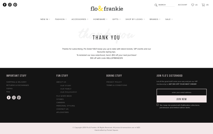
We’ve been lucky enough to work with the team at Flo & Frankie in creating a Welcome Email that aims to both initiate a first purchase as well as educate the customer on the background of the brand. Flo & Frankie offers a first time purchase incentive of ‘$10 off your first order’ which is highlighted just below their email’s main banner. With incentivised welcome emails, there are a few things to think about:
- Feature in email: Because Flo & Frankie’s brand is all about empowering women, we chose to put predominant focus on this before promoting the incentive. As we highlighted the incentive on-site (which I cover in more detail in the next point), we were able to keep the email as brand focussed as possible.
- Feature onsite: Many customers will be signing up to the email to redeem the incentive so they will want to receive that email ASAP! Alternatively, you can also opt to present the discount code/incentive on site. Do this by adding a feature to your sign up success state. Flo & Frankie displays the incentive discount code instantly on their thank you page.

- Incentive amount: when selecting the level of incentive, carefully consider factors like your average order value and units per transaction. Choose an incentive that is best suited to how your customers shop e.g. if you have quite a high UPT consider a dollar amount incentive over a percentage to keep the discount amount fixed.
With the above basics covered, your email will be a welcome your customers won’t soon forget! So seize the opportunity to connect with your customers, be proud of your brand and kick off each new customer relationship with a bang.
